


OCREB Website
Date:
5/1/2026

(01)
Overview
For my fourth co-op term, I joined the Ontario Institute for Cancer Research (OICR), working under the Ontario Cancer Research Ethics Board (OCREB) as a website designer. My main goal was to redesign their official website.
OICR is a provincially funded research institute that supports scientific discovery, clinical trials, and collaboration across researchers, hospitals, and institutions in Ontario. Within that, OCREB acts as a centralized research ethics board, reviewing and approving cancer clinical trials across multiple sites.
When I first looked at the website, it was clear that it did not reflect the importance of the work OCREB does. The user experience felt outdated, navigation was not intuitive, and it was harder than it should be for users to find key information like submission guidelines or forms.
My goal was to redesign the site in a way that feels clear, accessible, and trustworthy, while making it easier for researchers and applicants to actually get what they need.
Define
Very early on, I started hearing the same thing from team members. The website felt out of date and difficult to use. Even team members without a design background noticed that something was off.
After spending time going through the site myself, a few core issues stood out:
- It was hard to find important information quickly
- The structure did not match how users actually think or navigate
- The visual design made the organization feel less credible than it is
- Accessibility was not strongly considered
This helped me frame the problem more clearly. The website was not doing a good job supporting users in completing key tasks, and it was also affecting how the organization was perceived.
(02)
Ideate
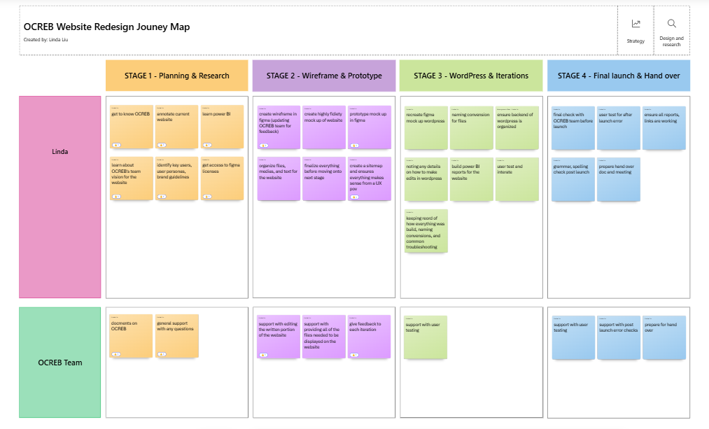
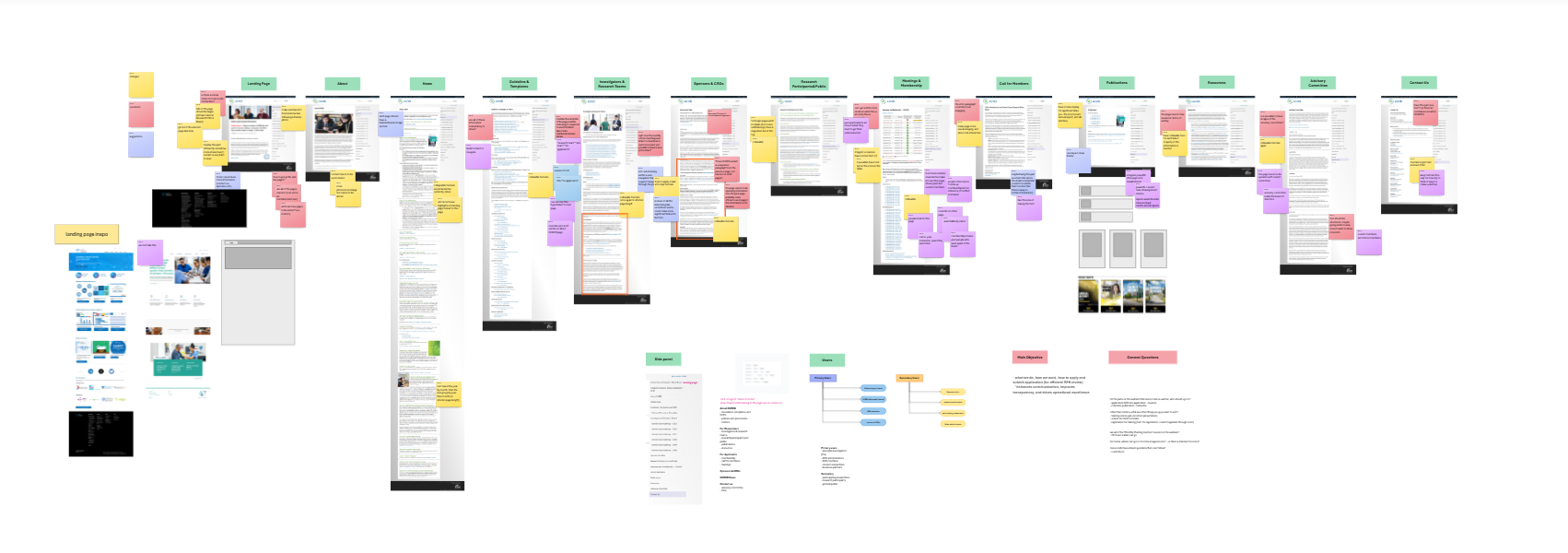
Once I understood the problem, I wanted to see everything at once instead of clicking through endless tabs. I mapped out the entire website using MS Whiteboard and Figjam to get a full picture of its structure.
This was one of the most helpful steps for me. It made it easier to:
- See what content actually existed
- Spot duplicates and inconsistencies
- Identify what information mattered most
- Get a sense of workload and plan the redesign according
From there, I started thinking about how to reorganize everything in a way that made more sense for users.
One decision I made early on was to shift toward a more task-based structure. Instead of organizing content the way it existed internally, I focused on what users are actually trying to do when they visit the site, like submitting an application or finding specific documents.
I shared these ideas with my managers in every initial stage to make sure I was heading in the right direction, which helped avoid misalignment later on.
(03)
Prototype/Refine
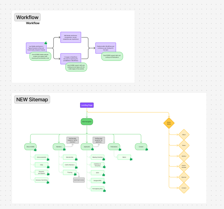
After fully understanding the team, goals of the new website, types of information that needs to be displayed, and had all my questions answered, I was ready to create my initial wireframe.
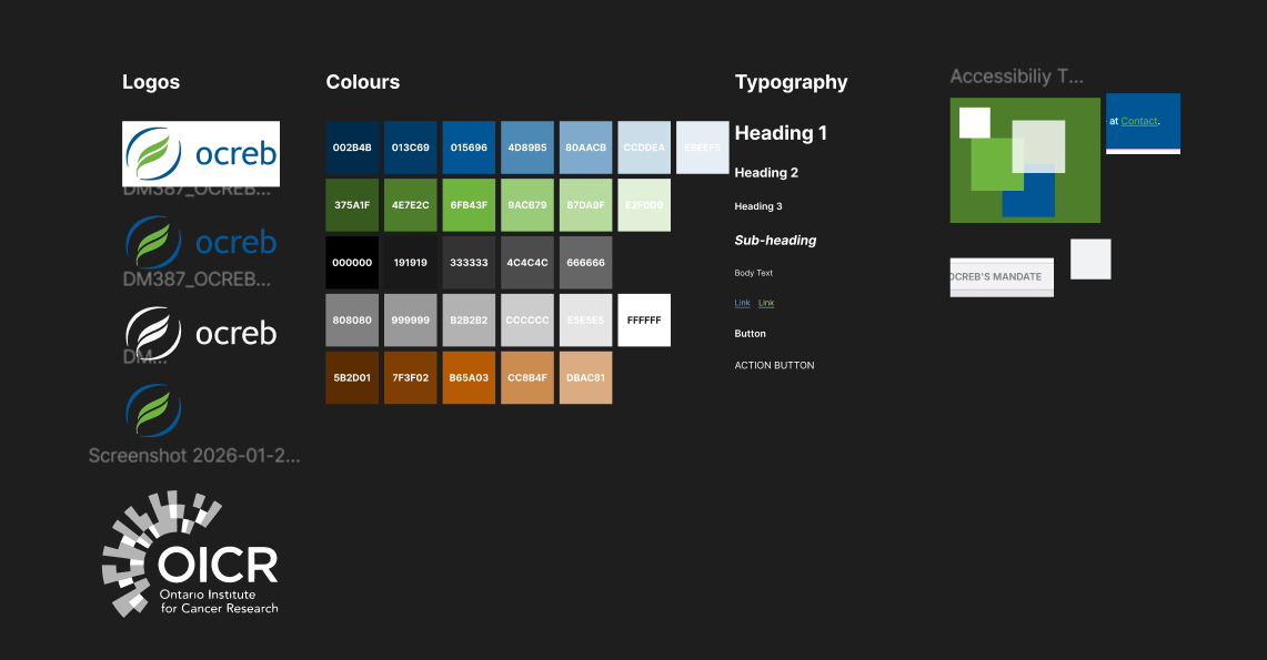
Knowing from the start, that this project was very self-directed and independent, no design team members, no developers (I would build the website I designed in WordPress), I had the support from my managers with any support I need in terms of user feedback and licenses requests, however everything else is up to my best judgement. Knowing this, I knew I needed a plan of action before diving into designing. My plan of attack was to create an initial wireframe, focusing mainly on the layouts and functionality instead of design components; then working in parallel with WordPress, I would create a higher fidelity prototype with more design components while ensuring WordPress is capable of replicating it (this is a special stage that emerged as the end design was not being passed to a developer); then lastly I would build all of the pages in WordPress, looking out for any accessibility and functionally issues.
In between each iteration, I ensured to connect with team members and managers to ensure the website at each stage is aligned with the team’s vision, and I continuously sought feedback to ensure there are no “bad surprises” with the final product.
This project was very independent. There was no design team and no developers, so I was responsible for both designing and building the website in WordPress.
Because of that, I had to be realistic with my designs from the start. There was no handoff phase, and the website would be built in WordPress, which is more limiting than developing a site from scratch. This meant that if I designed something that could not be built, it would slow everything down.
I approached my work in three stages:
Wireframing
I started with simple wireframes focused on layout and structure. At this point, I cared more about whether things made sense than how they looked.
Designing alongside WordPress
Instead of fully designing everything first, I worked in parallel with WordPress. This helped me test what was actually possible and adjust early.
One challenge here was balancing what I wanted to design with what WordPress allowed. There were moments where I had to simplify ideas to make sure everything stayed consistent and functional. It pushed me to think more practically about design decisions.
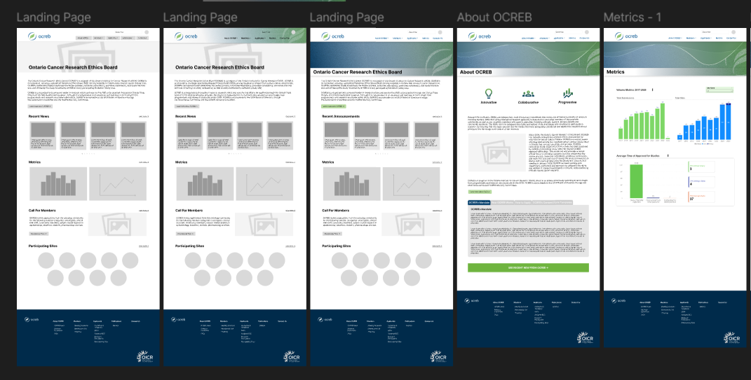
Building and refining
Once the direction felt solid, I built out the full site. I paid close attention to spacing, readability, and overall usability, while also making sure accessibility was improved compared to the original site.
Throughout all of this, I regularly checked in with my managers and team members to get feedback. This helped make sure there were no surprises and that the final result matched what the team needed.
(04)
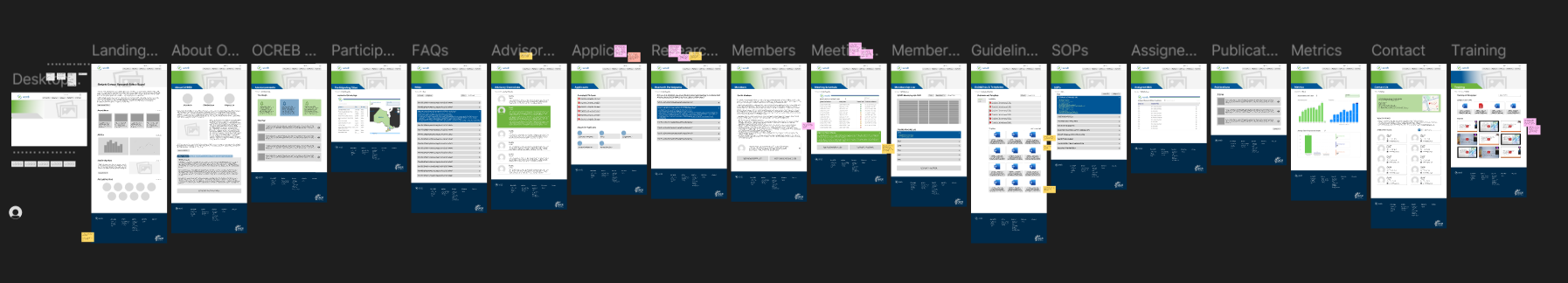
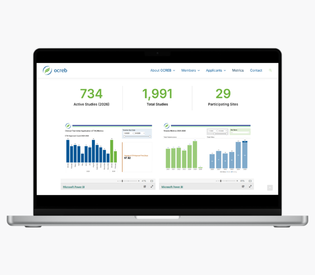
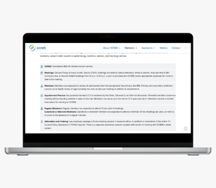
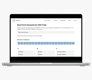
Final Design
Check out the final product at [insert link here]!
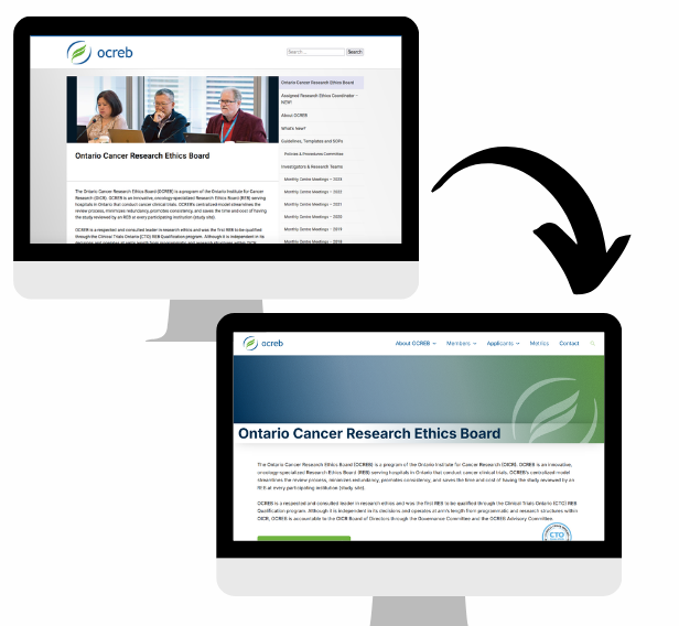
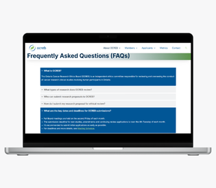
Compared to the original website, the new version is much easier to navigate and feels significantly more modern. Information is clearer, the structure makes more sense, and the overall experience feels more aligned with the organization.
Some of the key improvements include:
- Clearer navigation that supports how users actually move through the site
- Better organization of content so important information is easier to find
- A cleaner and more modern interface
- Improved readability and accessibility
(05)
Key Takeaways
This was the biggest project I have worked on independently, and it pushed me in the best way.
I had to make a lot of decisions on my own, figure things out as I went, and learn how to balance design ideas with real constraints. It made me more confident not just in my design skills, but in my ability to take ownership of an entire project.
One of the biggest things I took away from this experience is how important it is to adapt. Working directly in WordPress meant I had to constantly adjust and problem-solve, which ended up making my solutions more practical and grounded.
(06)
Thinking Aheading...
If I were to continue working on this project, I would focus on validating and improving the design through real user feedback.
Some next steps I would take:
- Run usability testing with researchers and applicants
- Use analytics to understand where users struggle or drop off
- Continue improving accessibility
- Look for ways to simplify key workflows even further